

The Teal & Orange Epidemic: A Visual Diagnosis
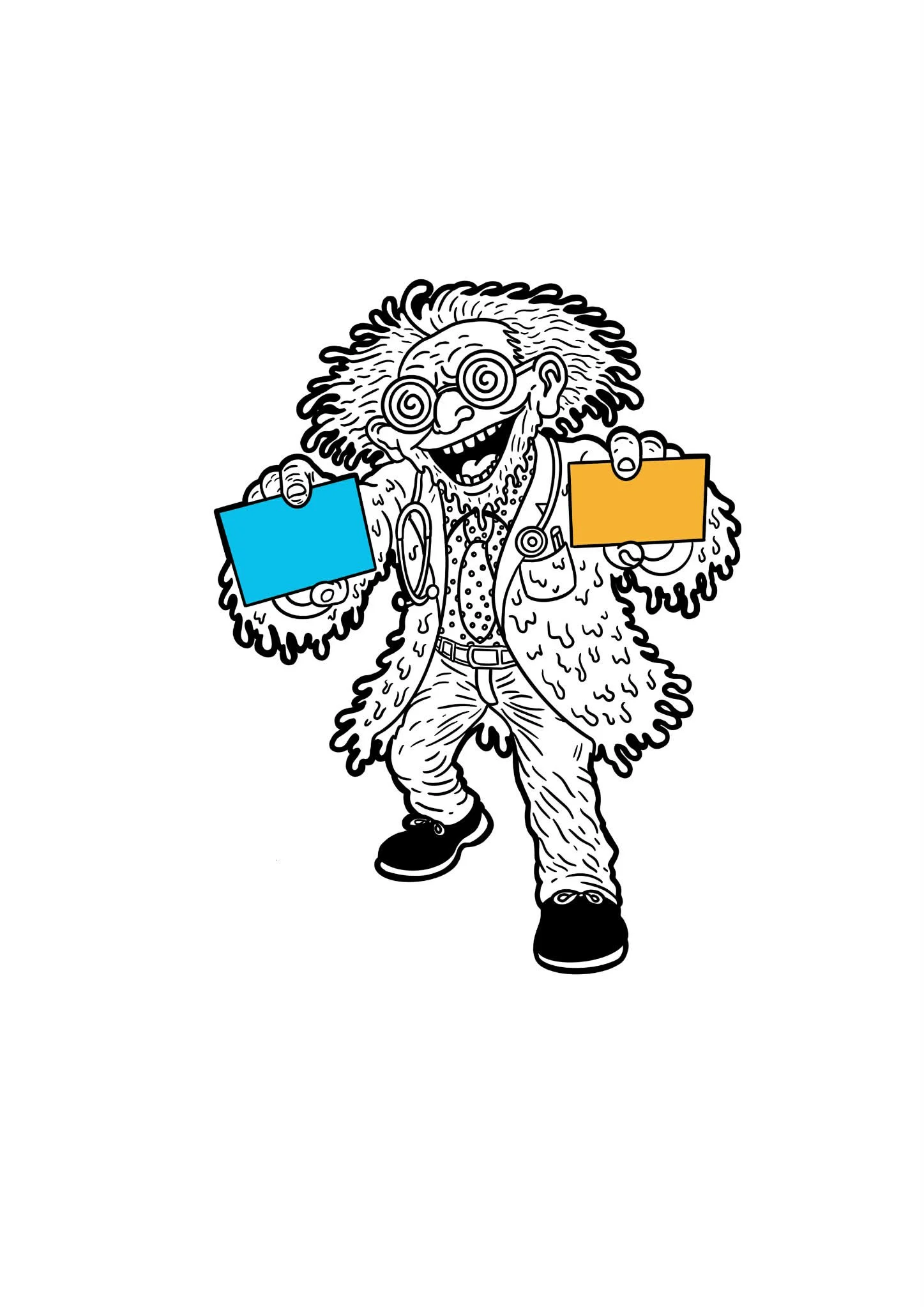
The Doctor Is In. Please Take a Seat.
No, not that chair. The other chair. Yes, that one was designed sometime after 2008 and is emotionally neutral by law.
Quick, name the two most common colors.
If your brain immediately whispered teal and orange, congratulations. If it didn’t, don’t worry. Your subconscious still knew the answer. I’ve reviewed the scans.
I’m Doctor Director, and this is your initial intake exam. What you’re experiencing is not a coincidence, taste, or personal preference. It is a widespread visual condition affecting modern cinema marketing.
Welcome to The Teal & Orange Epidemic.
Presenting Symptoms
Patients exposed to this condition often report:
Feeling “comfortable” looking at movie posters
Difficulty distinguishing one blockbuster from another
Recognizing the vibe before the movie
Trusting a film without knowing why
Common visual indicators include:
Cool blue-green backgrounds
Warm orange highlights on faces
Fire and sky politely color-coordinated
Emotional neutrality disguised as intensity
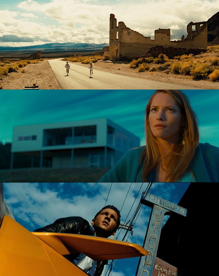
Pattern Recognition
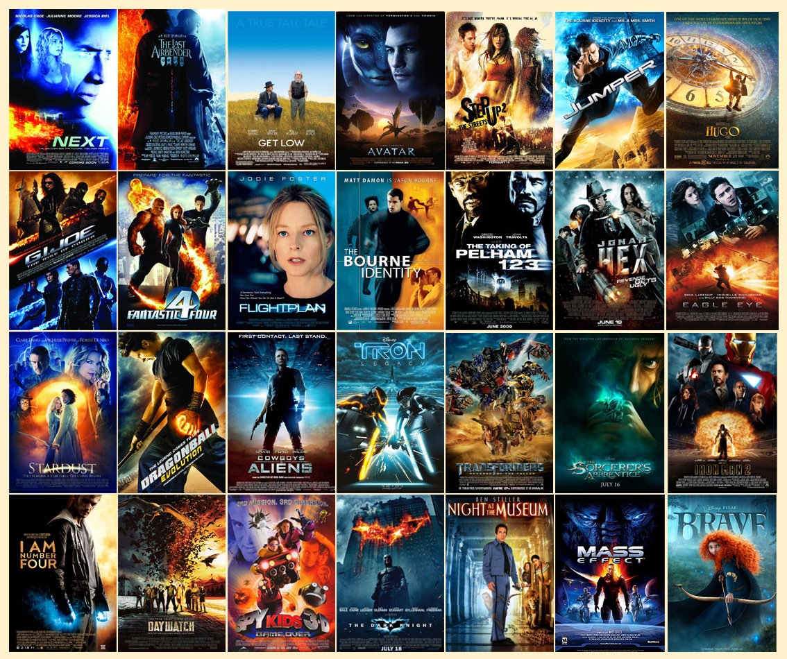
Doctor’s Notes: Different genres. Different studios. Same diagnosis.
Notice how the environment is always cool and controlled, while the human subject glows warmly like a trusted appliance. This color pairing is so consistent that it functions less as design and more as branding muscle memory.
The Root Cause (Chromatic Dependency)
Teal and orange are complementary colors, meaning they sit opposite each other on the color wheel. This creates a strong contrast with minimal effort. It’s an ideal solution when clarity, speed, and safety are required.
But Hollywood didn’t choose just any blue and any orange.
Teal is a softened, desaturated blue-green. It feels modern, cinematic, calm, and emotionally neutral.
Orange sits close to natural skin tones, meaning faces immediately stand out without appearing aggressive.
In short:
Teal = world
Orange = people
The brain reads this instantly. No learning curve. No resistance.
The Color Wheel
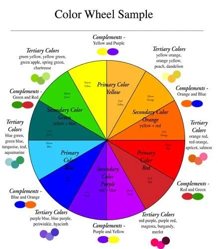
Doctor’s Notes: This chart is the smoking gun.
Opposing colors increase each other’s intensity. The result is visual clarity without chaos, with contrast that feels intentional rather than threatening.
Hollywood saw this once and said,
“Yes. Forever.”
Psychological Impact: Comfort Disguised as Excitement
Color psychology research consistently associates:
Blue/teal with calm, trust, and stability
Orange with warmth, energy, and approachability
This creates a perfectly balanced emotional state:
Calm enough to stay.
Stimulated enough to care.
It’s the cinematic equivalent of coffee and chamomile. Alert, but safe.
Your brain doesn’t feel challenged.
It feels at home.
Emotional Association Charts
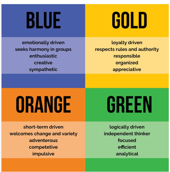
Doctor’s Notes: Note how none of these emotions involve risk, confusion, or discomfort.
This palette does not ask questions.
It reassures.
Familiarity: The Silent Reinforcement
There is a psychological principle known as mere exposure: the more often you see something, the more you tend to like it.
Over years of repetition, teal-and-orange imagery has trained audiences to associate this palette with:
Professionalism
Big budgets
“This is probably good”
This creates visual fluency in images that are easy to process, feel more correct, more legitimate, and more trustworthy.
By the time you notice the pattern, it’s already working.
Data & Trend Analysis
Doctor’s Notes: Large-scale analyses of posters and film frames consistently show a measurable bias toward teal and orange hues in modern cinema.
This is not anecdotal.
This is statistical conditioning.
The Industry Feedback Loop
Here’s how the condition sustains itself:
Teal-and-orange posters perform well
Studios repeat what works
Audiences feel comfortable
Comfort is mistaken for quality
The palette becomes default
At this stage, the colors no longer communicate genre or tone.
They communicate:
“This is a movie. You may relax.”
Side Effects
Long-term exposure may result in:
Visual sameness
Poster amnesia
Confusing multiple films released in the same year
Sudden appreciation for purple
If you’ve ever thought, “Why do all movies look like this?” the diagnosis is confirmed.
Prognosis
Is the teal-and-orange palette bad?
No.
Is it effective?
Extremely.
Is it wildly over-prescribed?
Yes.
What began as a smart visual solution has become an unquestioned reflex.
Doctor Director’s Recommendation
Next time you see a movie poster, ask yourself:
What would this look like without teal and orange?
Would it still feel trustworthy?
Or just… unfamiliar?
Awareness is the first step toward recovery.
References
Palmer, S. E. (1999). Vision science: Photons to phenomenology.
Reber, R., Schwarz, N., & Winkielman, P. (2004). Processing fluency and aesthetic pleasure. Personality and Social Psychology Review
Itten, Johannes. The Art of Color (complementary color theory)
Block, M. (2013). Filmcraft: Cinematography
Industry analysis:
“Hollywood’s Color Grading Trend” — various breakdowns by Every Frame a Painting (video essay)